动态排版
1 年前
28
问题一
因为不用考虑每一个区域的大小,而且只能在一个矩形容器中放入三种矩形内容,所以排版方式是有穷的,共 36 种。
计算方式如下:
布局组合:
一行三列、上一下二、上二下一、左一右二、左二右一、三行一列。
共 6 种布局组合。
文本、图片、列表的排列可能:
A(3,3) = 6两者相乘,得到 36 种排版.
问题二
可以用一个嵌套数组表示排版结构,外层数组表示行,内层数组表示每一行包括的列。例如:
问题三
通过 grid 布局以及 grid-area 和 grid-template-areas 可以实现。
完整代码如下:
效果如图:
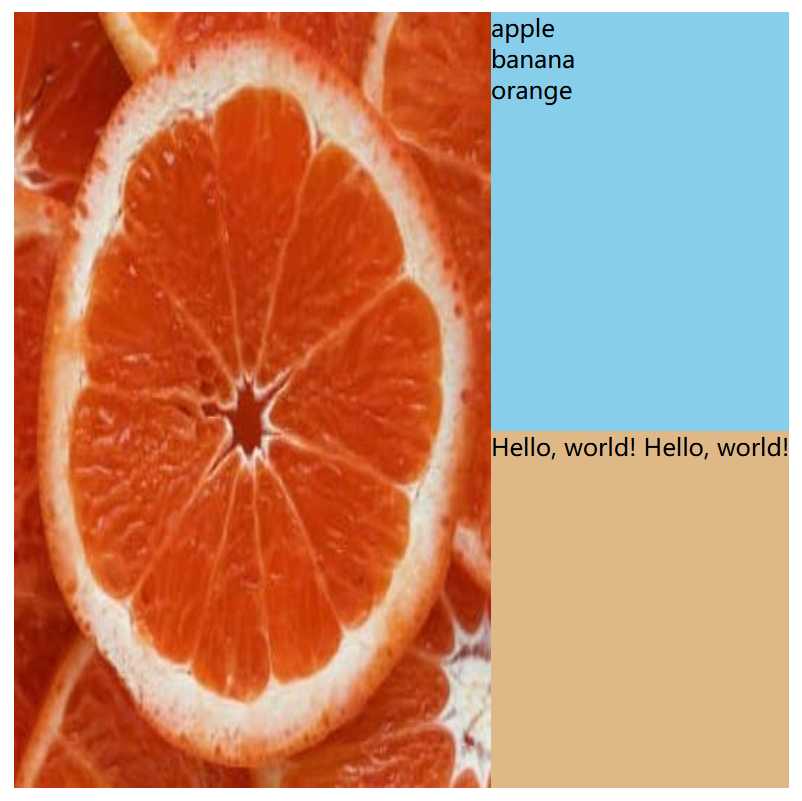
效果图